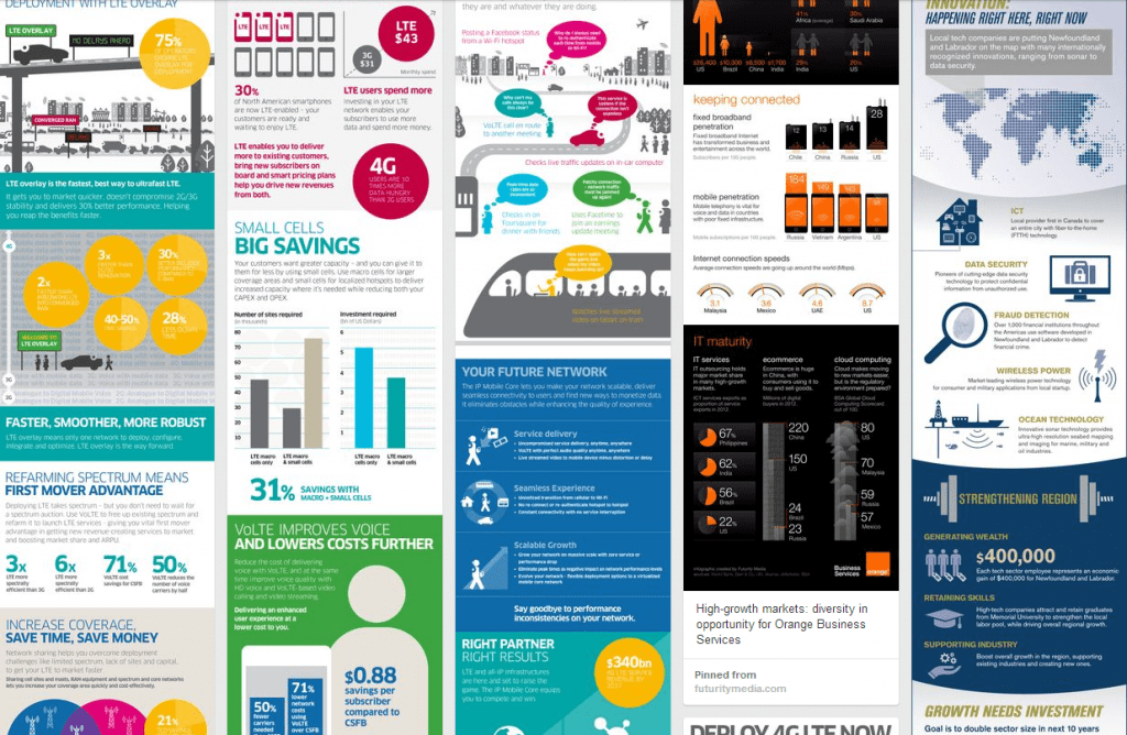
The slope of enlightenment: infographic as elevator pitch
A quick glance at Google Trends reveals that searches for ‘infographic’ and ‘infographics’ have sky-rocketed since 2010, increasing by 1000 per cent. Visual story telling wasn’t invented four years ago – we have cave paintings dating back 30,000 years and fossil records of Haynes manuals from the dawn of time – but the term ‘infographic’ was barely used until the social age.
Edward Tufte is credited with being a pioneer of data visualisations in the 1970s which led the deluge of stat attacks we see today. Take a few Noun Project icons and some poorly researched sales forecasts, a stand off between Apple vs Android, feed it all into a tired template and you have your very own infographics on smartphone wars.
The ‘hot then not’ medium has been used by news publications to show the number of deaths in terrorist attacks, by marketing agencies blathering about Twitter vs Facebook, and by global consumer brands who want to show they are down with the kids. And of course there are worthy infographics – visual representations of polemics like obesity, spending on armaments, bonuses paid in the City – which use striking images to alarm and shock. Combined, this deluge of good, bad and the ugly have led many to argue that we have reached ‘peak infographic’ and it is inevitably downhill.
To a degree, I accept this. There are too many dumb or confusing infographics clogging up my inbox. And yet, I don’t think we have heard the death knell: infographics are simply moving into the ‘acceptance’ phase of a Gartner hype cycle. We have been through early adopters, the peak of inflated expectations, the trough of disillusionment and now I think we’re on the slope of enlightenment.
End of a cycle
If the goal of an infographic is publicity and is measured in Likes and Retweets, then that is exactly what it is going to get. These social approvals are unlikely to entice a viewer into engaging with a brand or becoming more likely to purchase. This type of infographic can, at best, improve SEO. However, as the barrier to entry has dropped, the number of infographics produced and shared, has ballooned. With abundance comes diminishing returns and then the backlash.
Enlightenment is recognising that creating an infographic purely for SEO or social signals is a largely unfulfilling activity. It used to work well, now it doesn’t.
For me, the key thing about enlightenment is understanding ‘purpose’. Many of the companies we work with are better served by using visual storytelling to make a complex concept simple to understand, for instance as a product brochure. The infographic is then a 60 second ‘elevator pitch’: grab the audience’s attention, massage their minds and leave them wanting to know more. The audience may not be in the millions or even thousands. But put the infographic into the right hands – which could be just one CIO – and it will pay for itself many times over.
Our enlightenment
Our own infographic journey began in 2011 when we created this infographic for Orange Business, “Cloud Journey: how IT is evolving”. It was effective and well received, but our skill has improved considerably. Zip forward three years and about 50 infographics later and we are creating well-honed pieces like this one on High Growth Markets, which has good use of comparative data, or this one on Big Data Analytics, which has surprisingly few statistics but is very good at explaining a complex product. Another interesting example is Race Against Time: Healthcare for an Aging World, an infographic with some very striking custom illustration. What most of our infographics do is stretch corporate identity while remaining on brand: they are attractive, not stifled. The content and user journey is as carefully planned as if it was a web site refresh or product brochures. The design and content is not limited to skyscrapers. Our infographics are also used as slides, as event posters or as snap shots for a landing page.

For our clients in the technology industry, this is the future of infographics. Great content and design like this penetrates the noise and delivers genuine leads and helps account managers convert. When clients ask, ‘how does it work’ or ‘why should I be interested’, an infographic can convince in less time than a Powerpoint presentation or webinar. It’s a visual elevator pitch.
Author:

![Create the ideal white paper in eight weeks [infographic]](https://www.futuritymedia.com/wp-content/uploads/2020/02/Futurity-Whitepaper-Timeline-Graphic-v6-header.jpg)

![New to ABM? Follow these 5 steps to drive complex sales [UPDATED]](https://www.futuritymedia.com/wp-content/uploads/2023/04/shutterstock_1225782988.jpg)


